Launching a European line of care products on the Chinese market demands a personalised approach. We conducted a detailed study to identify the perfect style from packaging to website.
Creative concept
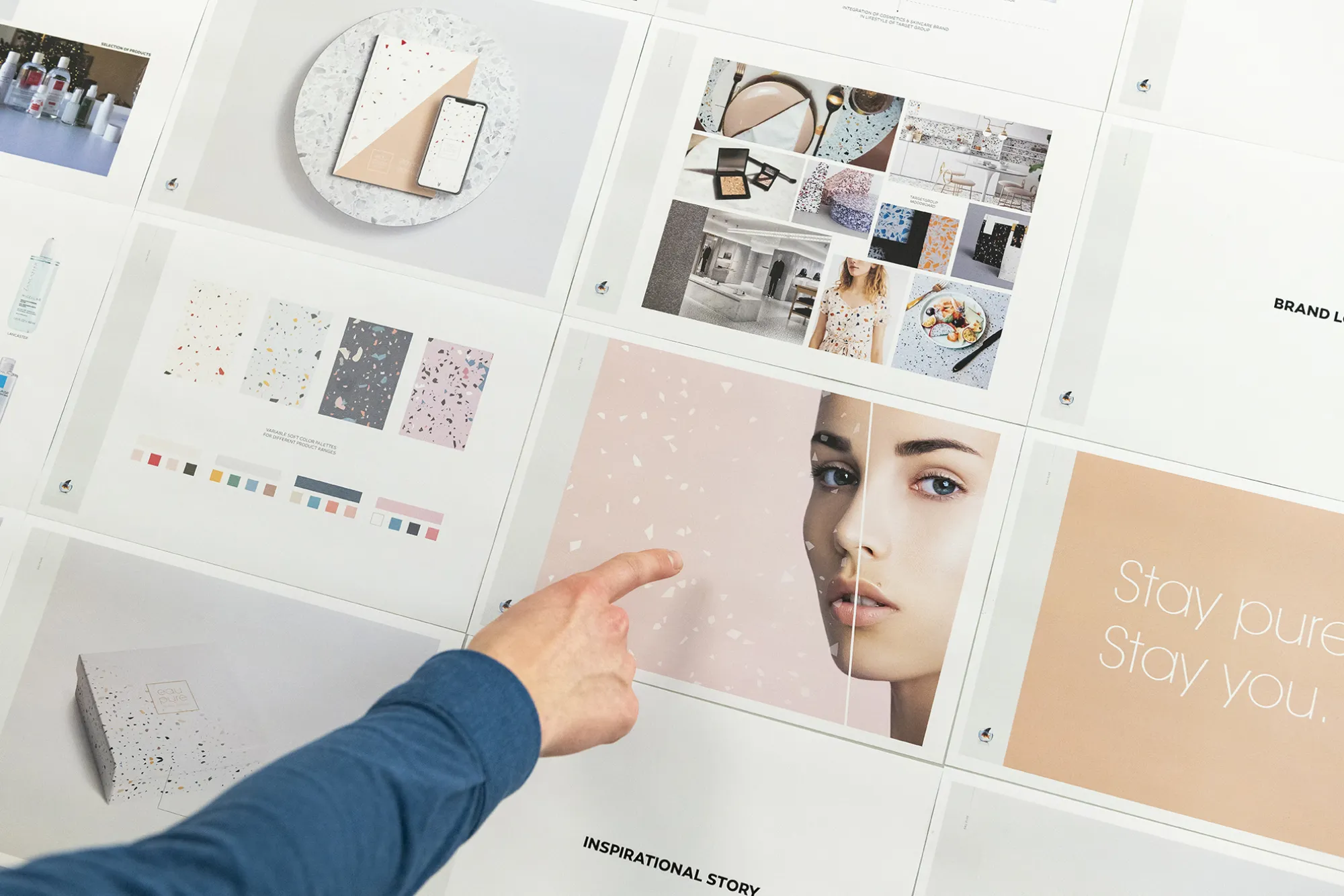
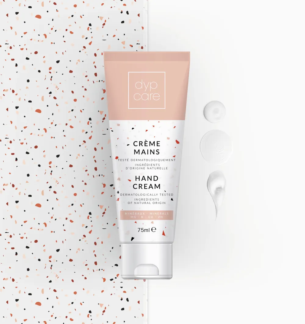
Dypcare has a skin care line consisting of five products for women aged between 25 and 35 years of age: body lotion, tonic, hand cream, micellar water and body scrub. For the launch of the range on the Chinese market our creative team went in search of a concept that fits the target group’s lifestyle and expectations perfectly, while retaining the European look and feel.
We based ourselves on a market study to create the look and feel that would most appeal to the target group.

Market study as foundation
We conducted a market study to get a good sense of the Chinese market and the product target group. Based on the results, we created a fitting look and feel in terrazzo style. The colourful chips of marble stand for the impurities in the skin, which Dypcare can target and eliminate. The soft pastels stand for purity, with different colours for different media.
From offline to online
In the next step our packaging team were tasked with incorporating the concept into a fitting line of packaging. The uniform packaging, which sets the tone of the brand and catches the eye of customers, ensures products are easy to spot on the shelves and provides full product details at a glance.