
How do you position a trade federation as a modern and relevant partner for an entire sector? For Frixis, D’M&S tackled this with a refreshed visual identity and a campaign concept that radiates the added value of the Belgian federation for HVACR professionals. The goal: to strengthen its reputation and attract new members.
Frixis plays a central role in the HVACR sector as an advocate, knowledge partner, and guide for professionals. That strong position was already there, but the visual identity and communication could be sharper and more consistent.
The challenge: positioning the federation as a modern, reliable, and connecting partner for installers, suppliers, and other professionals in the sector. Challenge accepted!
We started with a light rebranding of the existing corporate identity. The logo was given a new typeface and a fresher colour palette, making the brand look more modern and powerful without losing any of its recognisability.
To apply the new identity consistently, we also developed a brand guide with clear guidelines for the use of the logo, colours, typography, and visual language. This allows Frixis to roll out its communications consistently and professionally across all channels from now on.
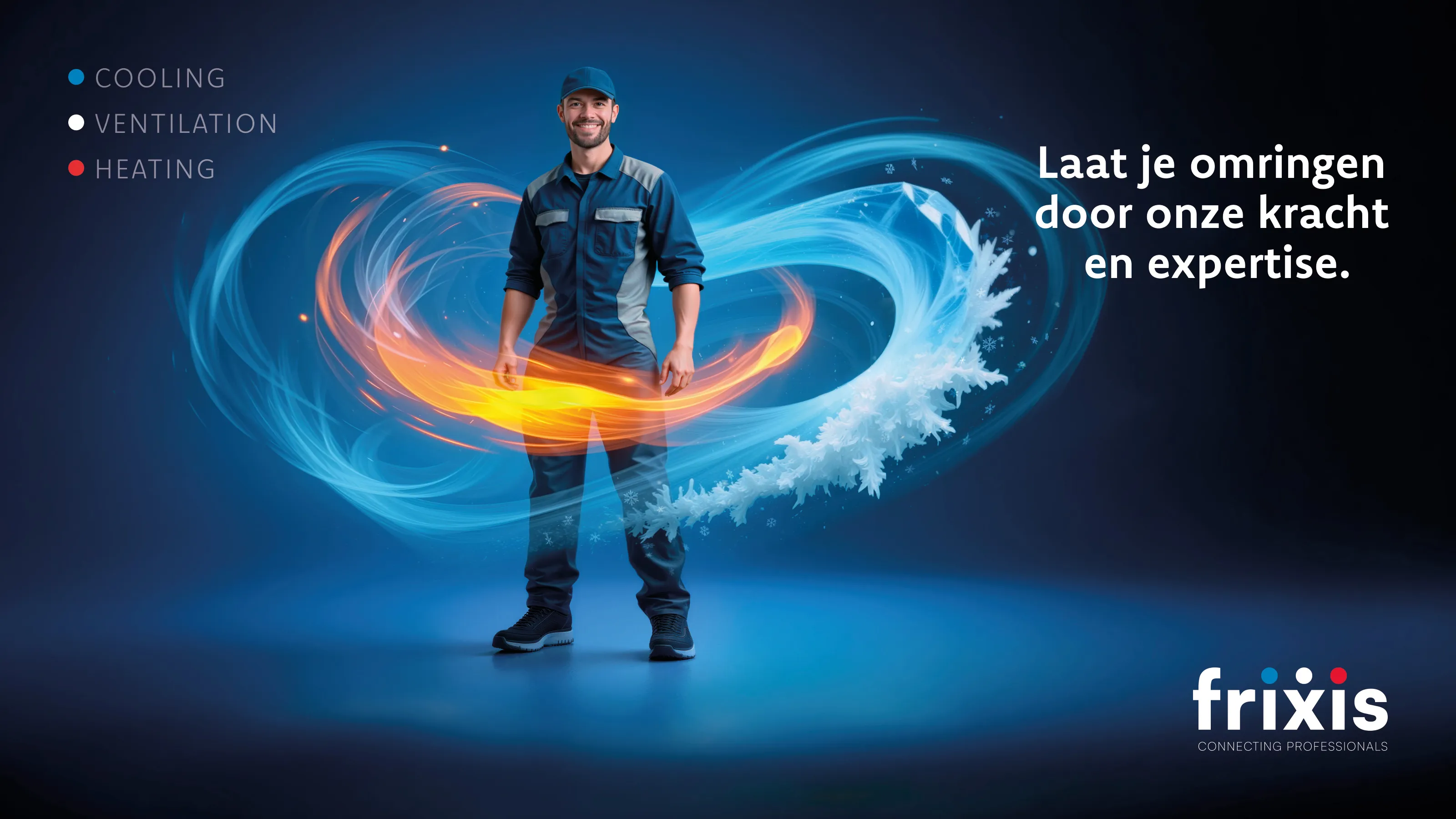
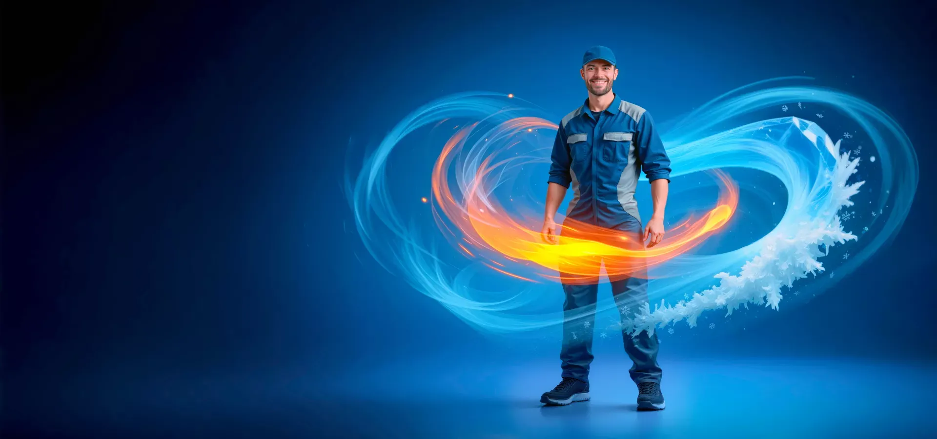
It features the craftsperson at the centre, surrounded by various energy flows – air, fire, and ice. A powerful visual metaphor for the different domains within HVACR and for the support Frixis provides its members.
The image creates stopping power and forms a solid foundation for member recruitment communications.
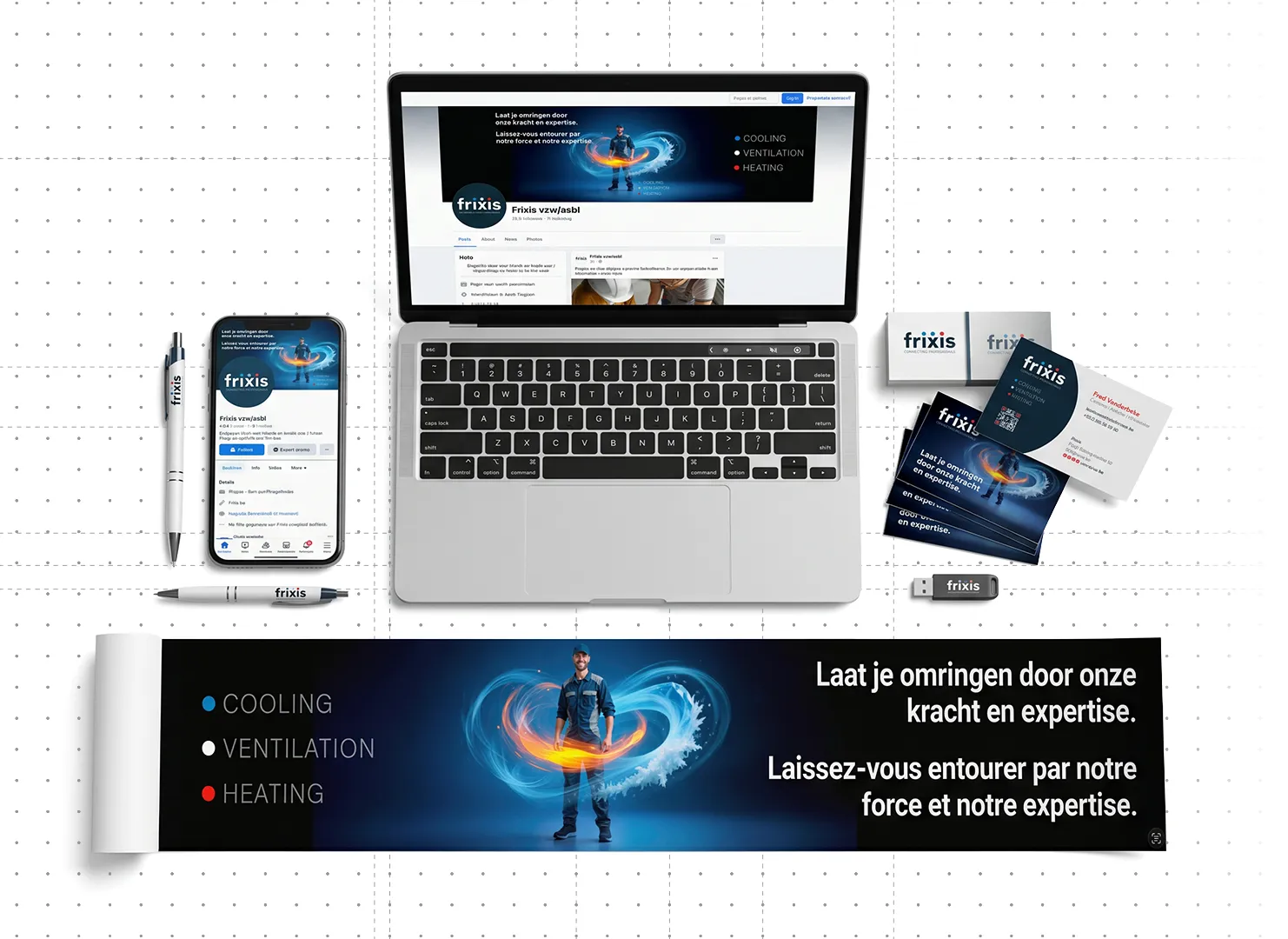
Based on the new identity and campaign imagery, we have since developed various communication tools that Frixis can deploy immediately, from stationery (business cards, letterhead, envelopes, etc.) to email signatures, social media banners, and print advertisements.
Frixis now has a coherent visual toolkit enabling the federation to clearly communicate its expertise, benefits, and industry role to both existing and future members.