

Six companies, one ambition: accelerating the energy transition.
Argona is the new one-stop partner for sustainable energy and installation technologies. We supported the group with an omnichannel go-to-market that delivered immediate results.
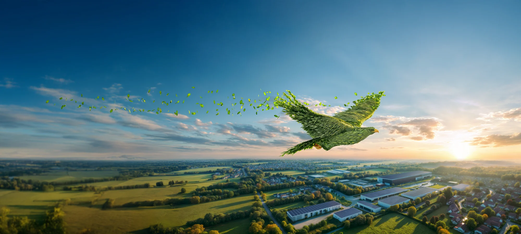
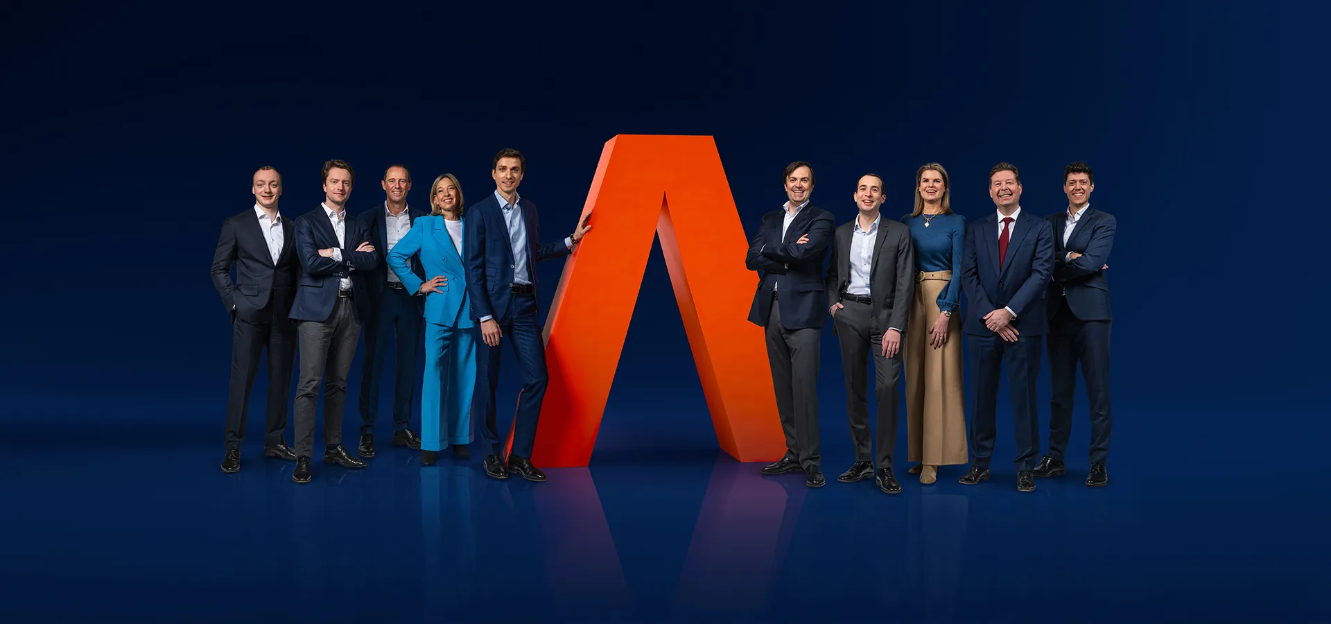
A powerful symbol of Argona’s sustainability ambitions and the eye-catcher in every communication channel. Awareness? Check!
We carefully rolled out the brand identity across a corporate brochure, templates, corporate identity documents and other tools. Every piece supports the same story, both visually and in content.
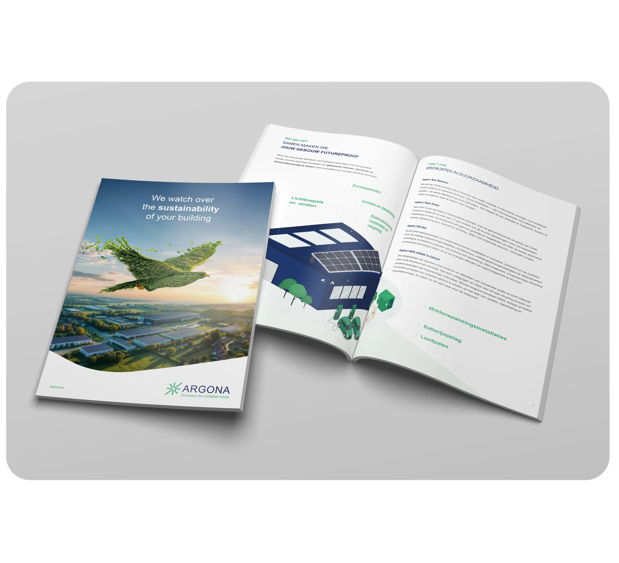
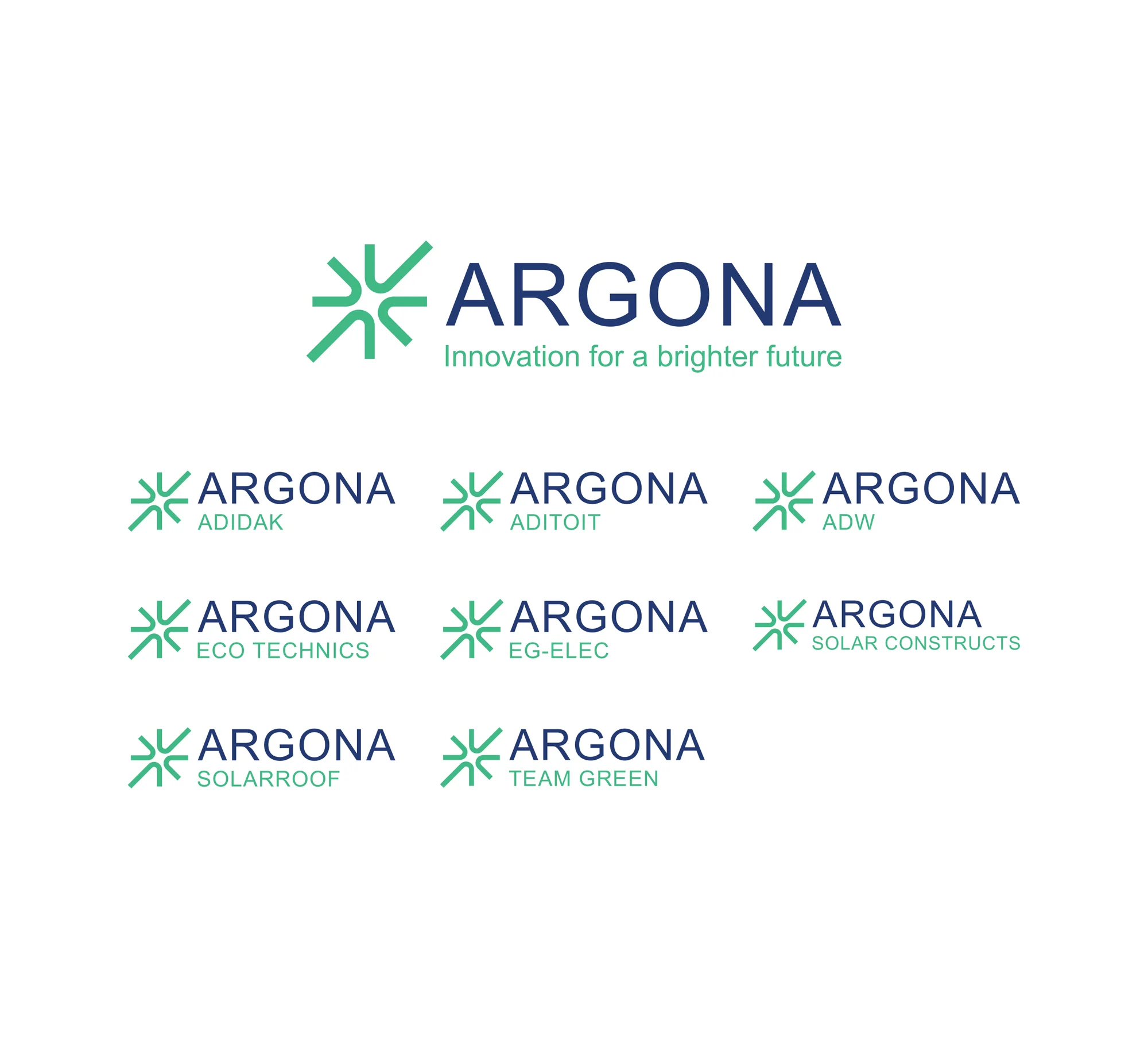
Three established names in renewable energy (Team Green, Eco Technics, EG-elec) are joining forces with three flat roof specialists (ADW, Adidak, Aditoit). Together, they make buildings smarter, more sustainable and future-proof.
That ambition resonates in the name: Argona. The reference to the Argonauts of Greek mythology symbolises teamwork and a higher purpose. The baseline Innovation for a brighter future runs like a green thread through the new brand story and forms the foundation on which we shaped the branding.
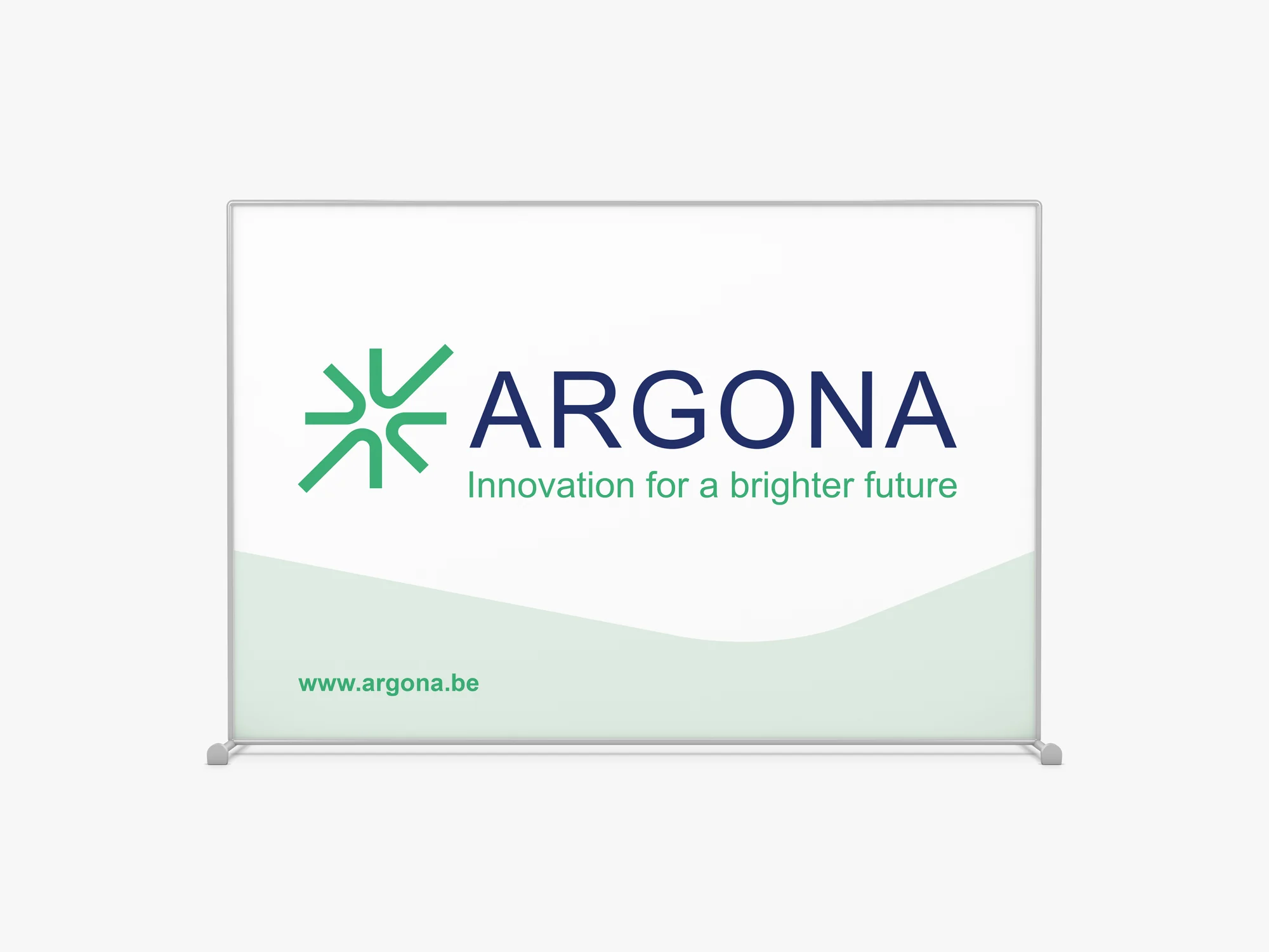
The new branding? Check out the logo, the colour palette and the typography. They radiate reliability and expertise, while the fresh touch of green creates the link with sustainability. The brand guidelines ensure that every channel – from website to construction site banner – conveys the same Argona look and feel.
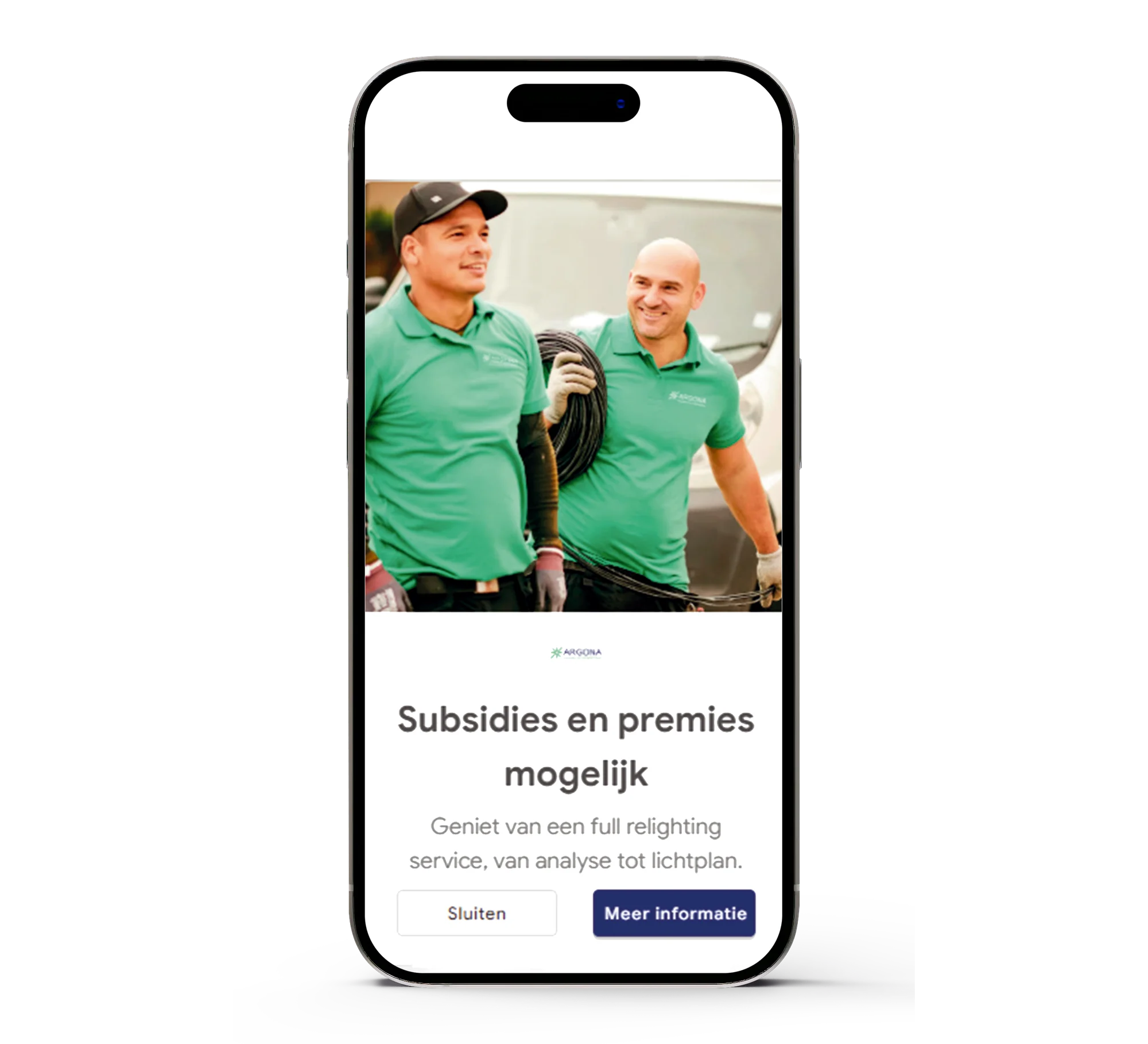
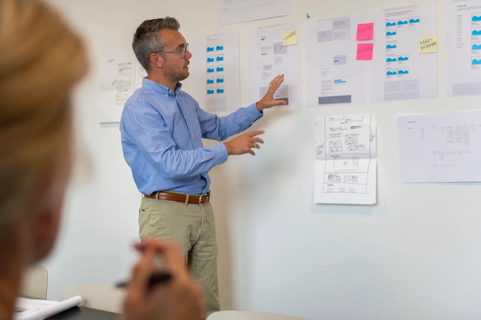
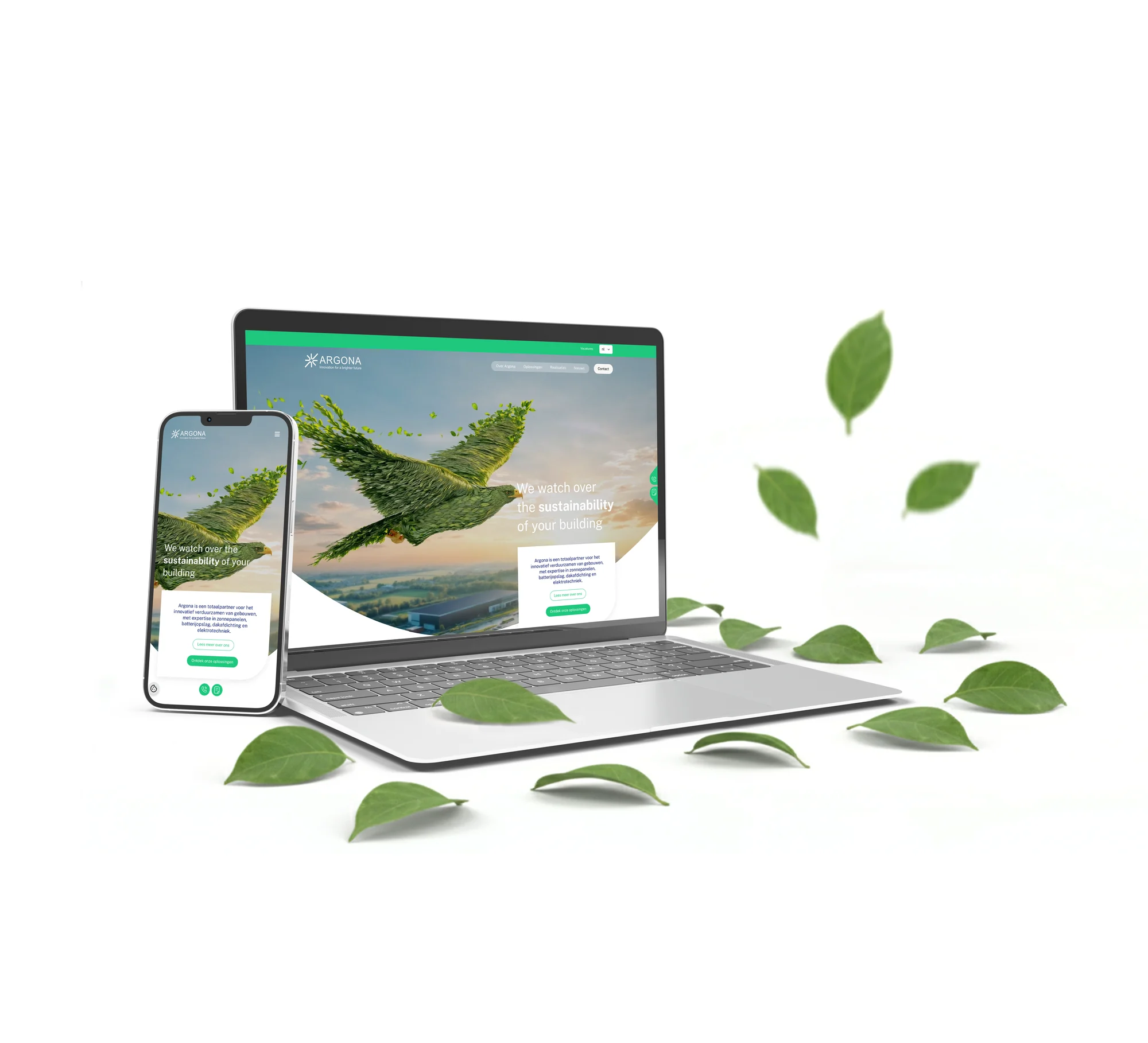
In line with the corporate identity, the new website combines visual impact with great ease of use.
• A clear split between B2B and B2C
• Intuitive UX and strong CTAs
• Content management via a user-friendly CMS
The result: a digital platform that convinces and converts leads.
The launch was only the beginning. Through targeted Google and social media campaigns, we keep building awareness and generating leads. This keeps Argona top of mind among businesses and homeowners who want to invest in sustainable buildings.