Two firms merge into one. Our branding specialists got round the table with Dicogel and Begro, two trailblazers on the frozen food market, to freshen up the new trendsetter’s communication and house style. But first the name…
New name stays in the family
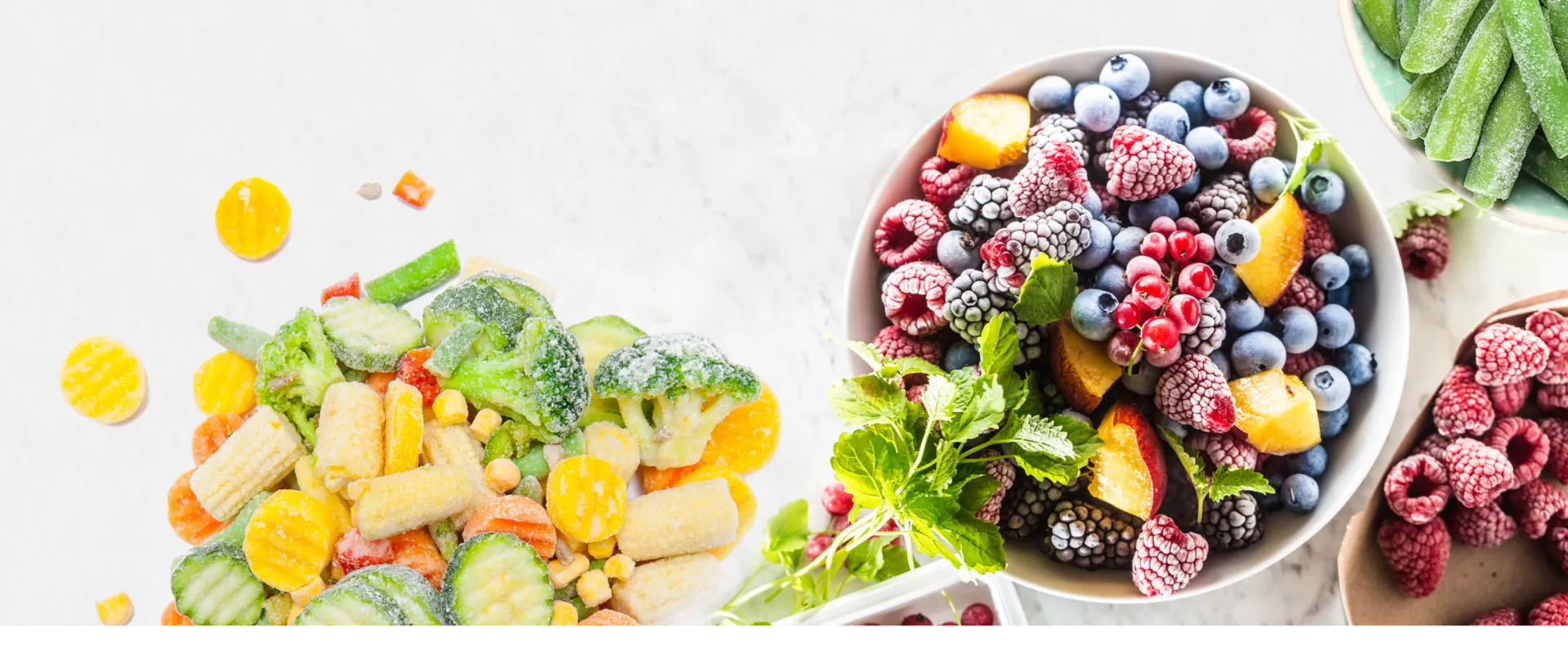
Dicogel and Begro, two big West Flanders-based names in fresh frozen vegetables were part of the same Dick family group for a decade. They merged into a single commercial entity on 1 January 2022. We were delighted to do the fieldwork in the quest for a new name.
That name had to exude trust, high-quality and continuity, while signalling a new chapter in their shared story. It also had to roll off the tongue in the different languages of international customers. The winner was Dicofoods, a portmanteau combining the family name and the product that it has excelled in for decades.
Logo and design boost brand image
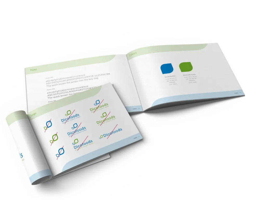
Our designers created a logo, featuring the new name in a refreshing font alongside two graphical elements. The green leaf and the blue dewdrop refer to the super-fresh character of the vegetables, which come straight from the field.
Dos ‘n’ don’ts
We set the guidelines for the house style based on the logo, which is supported by the tagline ‘premium frozen foods’. We collected all graphical dos and don’ts in a convenient manual, which has become the go-to guide to ensure the proper layout and uniform rollout of all communication tools. Vital when you’re building your brand image.
New website tells new story
To spread the Dicofoods story, we prepared a wireframe for the design of a corporate website with a clear UX structure and easy to read copy (in four languages). The design follows the precepts of the house style and gives the site a pleasant look and feel.
Check: www.dicofoods.com.